|
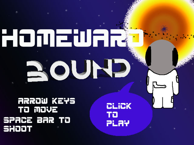
Game Unit: Homeward Bound
first we came up with the story and idea behind the project, then we designed the background and props for the game. My favorite part of the game other than it being done was creating the bosses. If I had more time, I would make the game harder and more detailed. Phenakistoscope
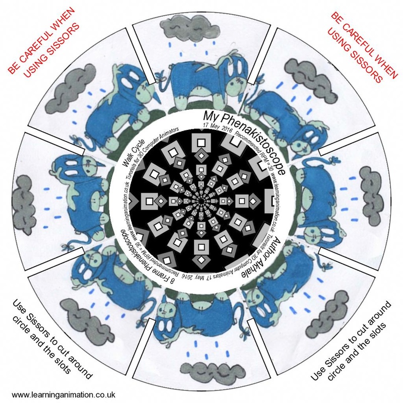
a phenakistoscope was an early animation device that used the Persistence of vision principle to create an illusion of motion. a loop is the illusion in the middle and works with the phenakistoscope is to help with the illusion that it is moving. my favorite part of creating this was coloring it in. My favorite old animation toy is the flip book because they are cute little books that you can make when you are bored and have paper and a pencil. Making a phenakistoscope is hard but easy at the same time, it takes a lot of effort, which makes it hard, but is fun, which makes it easy. My favorite photos
These are my two favorite pictures that were done by me. The technique that I used for the bottle was double exposure and a mix of the original photo, and the sepia version of it. The technique I used for the umbrella photo was emphasis. The strongest element for the bottles is color, and for the umbrella is emphasis. I did enjoy learning about photography this unit, because photography is something I am personally interested in, so learning about it was quite exciting. |
|
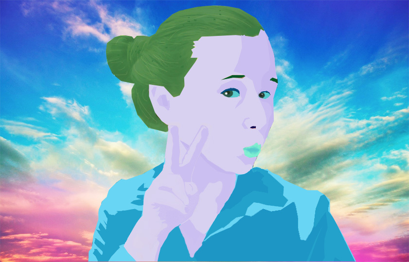
Color theory project
I used the color theory of cool colors. I do think it matches the expression, because it is relaxed and and soft. I selected this background, because I feel it is beautiful and consists of cool colors, just as my color theory that I selected. I feel that I used shades, but I don't think my tints and tones were as strong. I think my strongest element of art was color. |
|
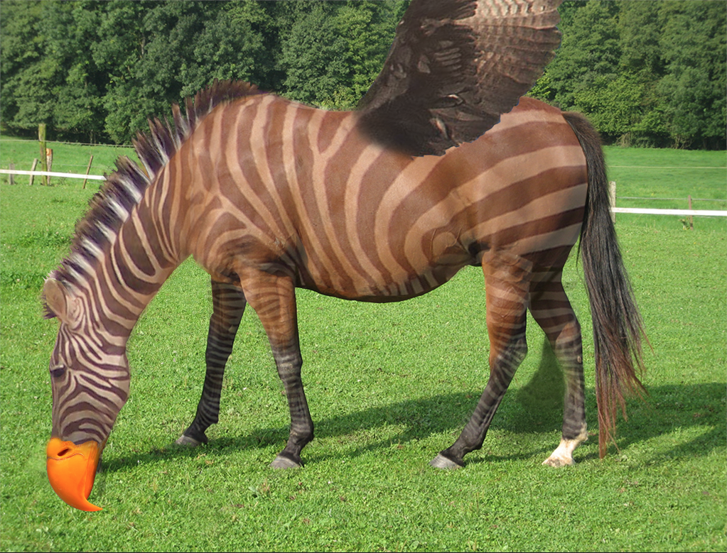
critter montages
In this project I combined a zebra, a horse and an eagle. the tools that worked best for me was the polygonal lasso tool, and eraser tool, I also played a lot with opacity within the photographs. The elements and principles that I feel was shown the most strongly was shape and color. I really like the product of this and I feel it is because of the effort put into it. |
|
Tessellation
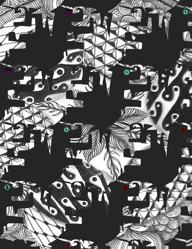
The element that I feel is strongest is shape an d the principle I feel is the strongest is variety. I feel if I would have hand drawn the tessellation then it would have been easier on paper, but since I copied a tessellation it was easier on the computer. I feel it was easier on the computer because I did not have to do the detailing of the tessellation so it was easier and faster for me. the artist that we learned about for this project was named MC. Escher. I love how cool it was to create this tessellation and how the shapes randomly turned out. |
|
font bot project
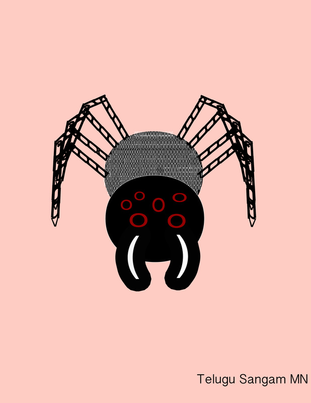
This is my spider-bot the font i used was Telugu Sangam MN and it is a serif font. I believe that my font does go along with the picture. It was somewhat fun creating it in photoshop, I did not like that I had such a hard time adding detail, but I did like how easy it was to create the base ( much easier than I thought.). my font bot would be like any other spider, except much more intelligent than even a human and plot to take over the world. |
|
Square 1 art project
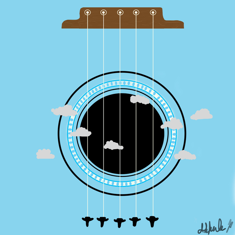
The process I used to create this image on photo shop was I first looked for an idea of what I wanted to draw, after I found what I wanted to use for my drawing I started with the circles in the middle and after I did the middle circle I worked on all the little ovals inside of the white ring (which took a really long time!). After I finished the ovals I moved on towards the wood piece at the top, then I did the circles and line that are layered on top of the wood. for the planes i drew one, screen shotted it and traced it over and over again. the last thing I did was the clouds which were quite easy. The principle that I find to be the strongest is proportion. I think this is the strongest because it is sized to where it fits and one thing does not look too big compared to the rest. The strongest element I feel I have is shape because there are alt of circles, ovals and other kinds of shapes all over the photo. I did not like using the tablet, because I found it difficult to find out where my brush was depending on where it was on the tablet. |
|
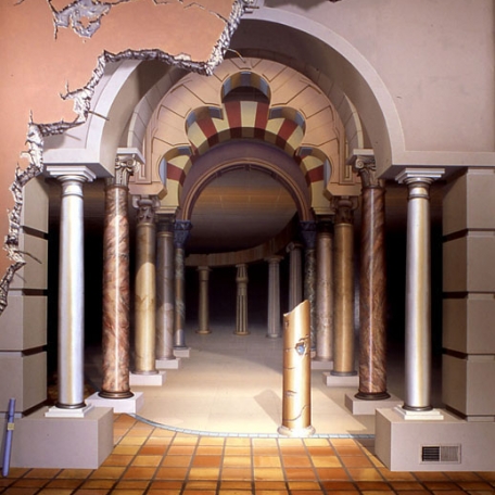
Beautiful Art!
John Pugh is an incredible artist who uses detail in his art to make it look as though it is just a photo taken by a camera. he has done lots of art that is just as realistic or maybe even more realistic than this photo shown. if you would like to see more of his art just click on the blue link!!!! |
